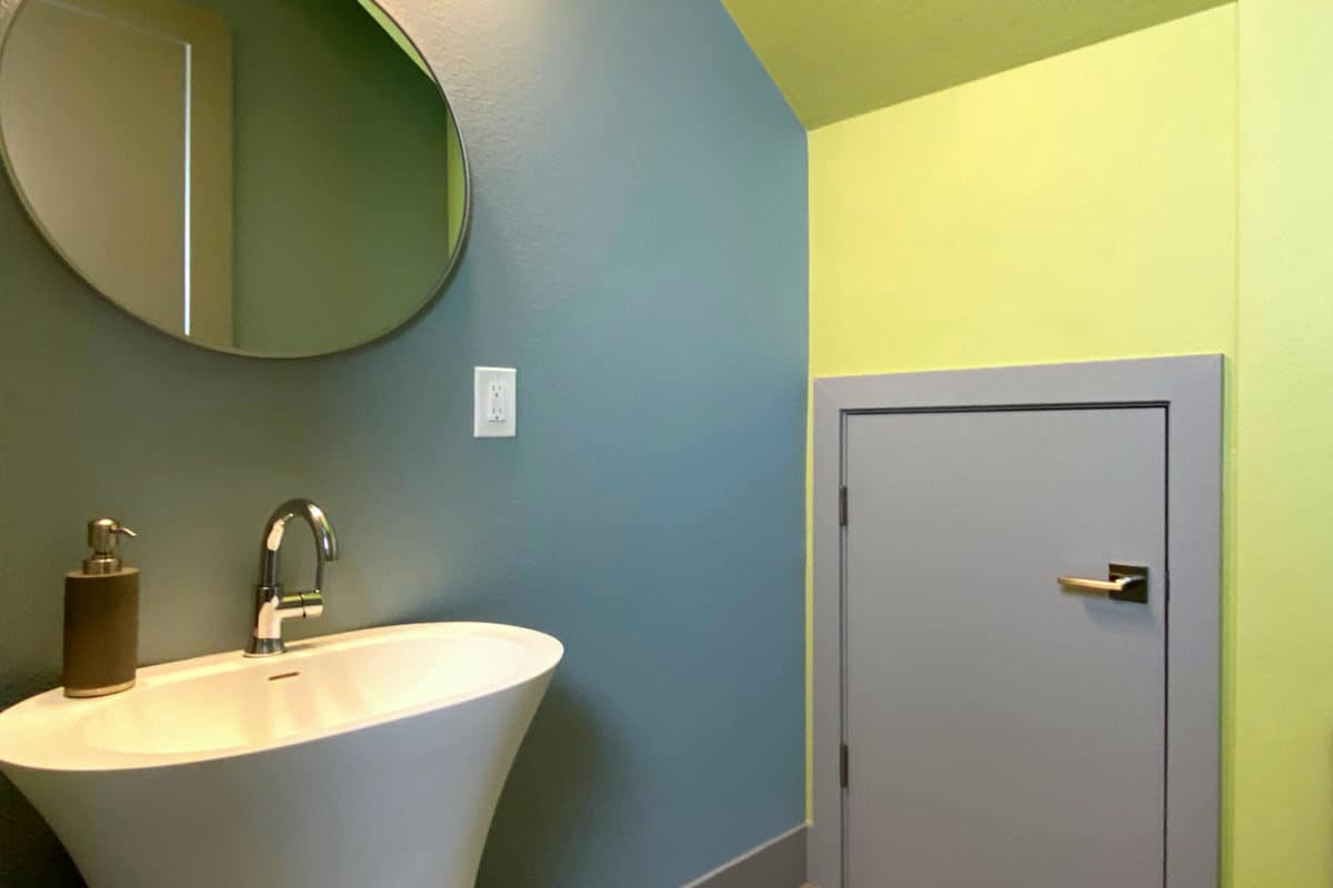
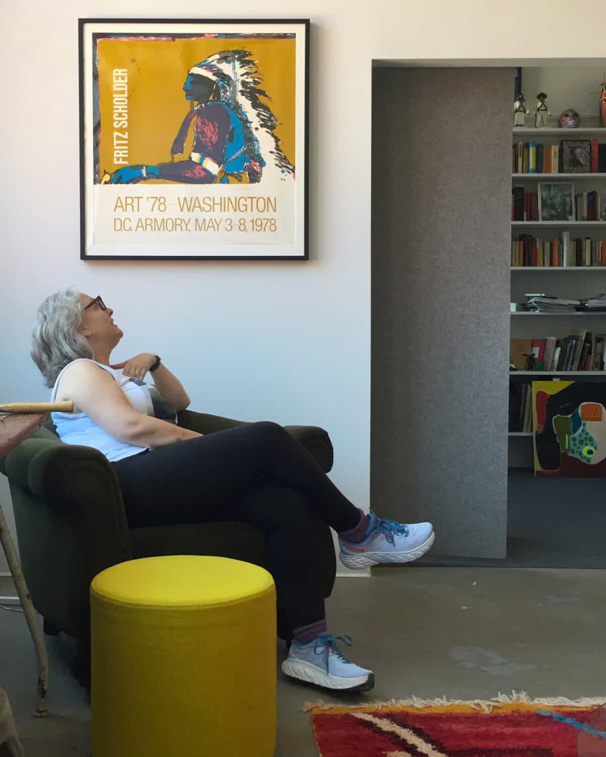
There has always been great interest in exploring color in our environment……
Color elicits response, both consciously and unconsciously, both visually and emotionally. Perception, by its very nature, is highly individual. By extension, the perception of color is uniquely individual as well. The study and language of color, the theory and interaction of color, are important tools in the pursuit of the knowledgeable use of color. My own color fluency began at an early age, surrounded by my father’s paintings and my mother’s beautiful decor. I was yet aware that not everyone had such an informative environment.
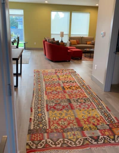
Color carries its own form of expression, emotion, energy and personality. The introduction of color in our living or working environments can be explored with a myriad of different methods — the most common is the use of paint color on walls or ceiling surfaces, or the exterior surfaces of a building.
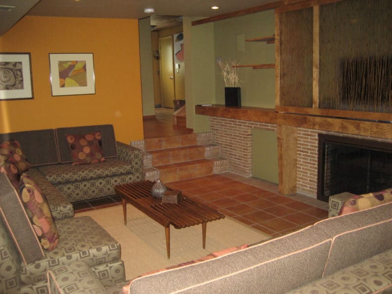
Additional vehicles for introducing color into an environment, often applied in tandem with paint color, include the use of textiles, furnishings, materials & surfaces, artwork, and flora. Lighting also plays an integral role in maximizing the desired effect of a given color, so making decisions related to lighting and light source should be explored simultaneous to the consideration of color.
“If one says ‘Red’ – the name of color – and there are fifty people listening, it can be expected that there will be fifty reds in their minds. And one can be sure that all these reds will be very different”. — Josef Albers
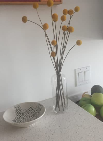
A common misconception and apprehension about using color, especially in interiors, is that it will be too limiting, or too much of a contrast from the most common absence or dilution of color. Using color doesn’t categorically mean it will be bright or overpowering. If color is well-used, it can be muted, subtle, or even obscure. The variations and ranges are endless. Preferences of color vary as much as individual preferences for furnishings or architectural styles. I delight in guiding clients towards color harmonies they are most drawn to, and would most want to have and enjoy in their surroundings.
“Color is like cooking. The cook puts in more or less salt, that’s the difference!” — Josef Albers
Color trends in the industry can have great influence, although fleeting and temporary by nature. Trends alone are market-driven and relatively short-lived, neither of which reflect my design practice or philosophy. My design approach is to interpret trends on behalf of what best suits a client’s needs, style and project. Thoughtful color selection is an exciting opportunity to reflect a client’s personality and style, to enhance and individualize their interiors. Formulaic trends create no such opportunities or distinctions, nor do they consider color interrelationships within a given project. The pleasing longevity of individualized, unique design solutions, customized specifically for each client are important tenets in a holistic design practice and process.
Informed and thoughtful implementation of color is a crucial component to designing a living or work space successfully…..and it’s one of the transformations which makes a substantial impact on the overall value of any design project. Despite commonly being overlooked, misused or misunderstood, the impact and importance of color remains a prominent aspect of discovery and enjoyment in all projects. Whether understated or pronounced, color is an integral aspect of my visual design vocabulary.
Two timeless references which I would highly recommend:
- Albers, Josef. Interaction of Color, Yale University Press, 2013 – 50th Anniversary Edition
- Itten, Johannes. The Art of Color, J. Wiley & Sons, 1974


